
The anatomy of the letter
The skill of a type designer lies in the art of subtlety. A smidgen of extra stroke thickness can result in a completely different impression of the heaviness of a body of text. Poorly designed letters can appear as blemishes in the text. Letter shapes that have been used for centuries cannot simply be altered without affecting the complete picture. And we have not yet mentioned the habituation or actually the conditioning of the letter. In the past, radical changes in typography (in newspapers, for example) provoked some very serious reactions from the readers. The designer of typefaces intended for use as body types should be aware of this and should design right down to the finest details in form and counter form, in the black letter and the white space around it.
Back to top
The design process
In this chapter we will investigate the margins available to the designer and study the form of the letter in detail. The number of different typefaces currently available is thought to be around 50,000 to 60,000. Is it then really necessary to design even more new types? Well, the same question could also be asked about the design of a new chair or a new musical composition. The times in which we live will always play a part in this process by applying different demands and awakening new expectations. The desire for innovation and change is always present.
Back to top
The first capitals
The Roman inscriptional capitals, the mother of all western capital or majuscule scripts (see also the chapter The Roman and the Roman Empire), have a geometric construction with a square base.
Back to top
The Adobe Trajan shown above, which was designed by Carol Twombly and is based on the inscriptions on Trajans Column, shows the geometrical construction method used to draw on the stone before the cutting began.
Lhistoire se répète
With the invention of printing presses and the subsequent growth in the production of printed material, a uniform grey tone within a body of text and optimal legibility became more and more important. Type designers as well as printers who certainly in the early days were responsible for good typography became more aware of the details of type. There followed a centuries-long continual stream of new typefaces onto the market.
Back to top
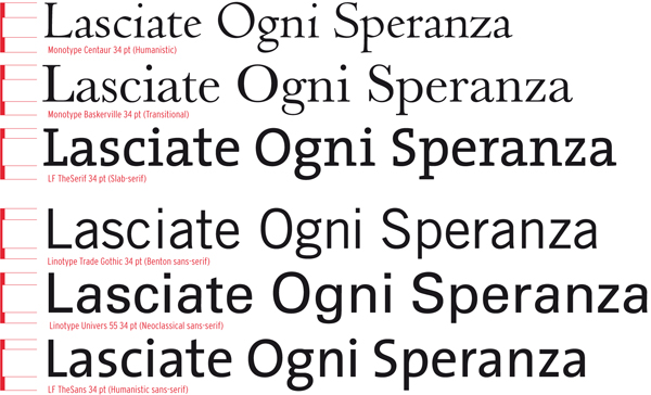
Three letters are shown above. This illustration functions as a quick reference from the beginnings of western type design, with Imperial Roman capitals (Trajan), via Bodoni (here the Classico by Franko Luin) and then to Linotype Compatil Exquisit a journey spanning almost 2000 years of (seriffed) type design.
The lowercase letter
Lowercase letters did not exist in Roman times. There is therefore no historical reference for these small letters such as there is for the capitals. The handwritten, vertical square capitals and the rustic capitals written with a slanting quill were the starting points for the development of the uncial, the half uncial and the Carolingian minuscule.
Back to top
The examples shown above illustrate that capitals are mostly heavier than lowercase letters. They also show that the x-height of sans-serifs is usually larger than in serif letters. Of course there is an exception to every rule. The weight of the capitals and lowercase letters in TheSerif and the TheSans is as good as equal.
Classification according to form and construction
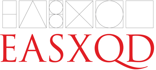
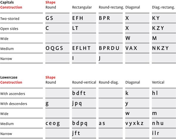
Depending on their form and construction, the 26 characters of the alphabet can be arranged into groups, whereby a distinction is made between a group for the capitals and a group for lowercase letters.
Back to top
What you measure is not what you see
As can be seen above, many different forms and constructions must be taken into account when designing a new type. An important visual correction is the extrusion of curved (and protruding) forms past the baseline and top line. This also applies to vertical alignment between curved and straight forms.
Back to top
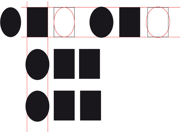
A number of corrections have been applied to the oval and rectangular shapes above. The first oval has the same width and height as the rectangle next to it, yet the oval seems smaller and appears out of line with the rectangle (even though it actually lines up perfectly). The second oval has been visually corrected, both in width and height. The diagram on the second line shows that equal white space between the shapes in the middle does not appear the same. A visual correction has been applied to the bottom example.
A visual correction is also needed for the distance between letters. It is not possible to simply place letters next to each other with equal spacing between them. The letters must be altered to a uniform visual white space. This means that the white space between the letters should appear the same.
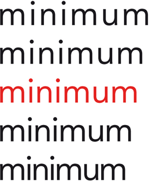
The word minimum appears above in Avenir by Adrian Frutiger. The letter spacing is uniform because all the letters are vertically defined. It is a good way to determine an acceptable amount of letter spacing in the early stages of a new design, which can subsequently be applied to the less clearly defined letters. In the trade this is called fitting the type.
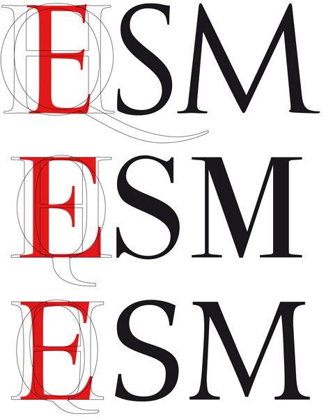
The first letters
Each type designer has her or his own way of working toward the creation of a new typeface. As well as the H, O, n, l, o and p, Dutch type designer Gerard Unger also likes to include the R, a and g in his first design sketches. Alongside this unique working method, there are also a number of facts to take into account during the design process. A square appears to be square only if it is drawn 1% wider and the same is true for circular forms. To make a circular form appear the same size as a square, it should extend an extra 2% to 3% on each side. The point of a triangle appears to line up with a square only if it extends 3% further. These are of course just indications. The definite measurements are completely dependent on the design and the designers eye.
Back to top
The Monotype Perpetua shown above is a Transitional in Vox+. It has an almost vertical to vertical axis. The lowercase letters are slightly thinner than the capitals and the capitals have a greater thick-thin contrast.
The letter o
This letter appears simple in construction. Looking at Futura, this could quite easily be true, but even the construction of this version is not exactly geometric. The circles and ovals have been visually corrected in the corners and curves.
Back to top
The letter l
Just as the letter o is defining in the form of the curves in a type design, so is the lowercase l defining in the thickness of the stem. Just as with the curves, it does not follow that everything with a similar form is equal in thickness, but it is a starting point for similar forms.
Back to top
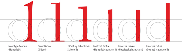
The examples above show that there are numerous options for the design of the top serif of the ascender and the proportions of the x-height. The letter l forms the basis for many letters, making the design of this letter very important for the overall look of a typeface.
The letters c and e
When the proportions, contrast, maximal curve thickness and thickness of the stem have been defined, the related forms can then be designed. The logical steps from the o are the c and e.
Back to top
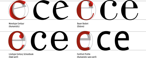
The terminals of the c are the most varied in shape, ranging from the clearly visible form of an old-fashioned pen stroke to the clean lines of a teardrop shape.
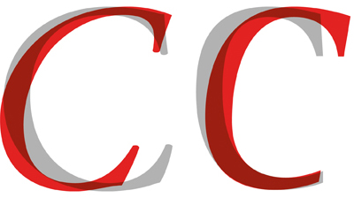
The capital C in italic and regular superimposed. Left: Stempel Garamond with an italic that is visibly different from the roman. Right: Rotis, whereby the roman is similar in appearance to an italic as it leans forwards slightly.
Rounded letters with a stem
Four letters of the alphabet the d, p, b and q appear quite simply to be a blend of the o with a vertical stem. The p looks like a rotated version of the d and likewise the q a rotated b. But this could not be more wrong. Even the most geometric typefaces contain subtle differences. The greatest differences can be seen in the seriffed types.
Back to top
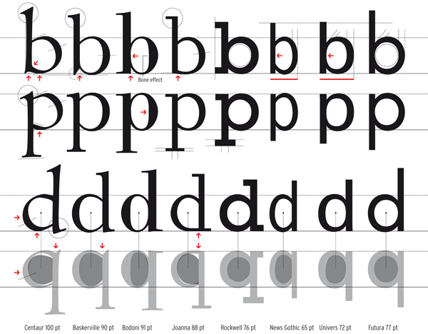
In the overview above, the characters appear to be mirror images of each other. Wrong! With Bodoni it seems as if two letters have been merged into one, while with the Joanna each letter has its own characteristic shape.
Letters with legs
There are four letters which are directly related to each other because they all stem from one letter: the n. These are the letters n, h, m and u. The letter r can also be included in this group because it, perhaps a little generalised, can be seen as a cut-off n, in the case of the sans-serifs at least.
Back to top
Three outsiders
The a, s and g require a depth of knowledge and skill from the type designer not only to design them in line with the rest of the typeface but also because the curves must be balanced and fluent. While geometrically rounded shapes form a good basis for the design of the letters o, e and c, these letters are more complicated than a simple circle. Designs elements similar to the other letters must be incorporated into these letters.
Back to top
The a consists of a bowl and curves. The closed bowl is slightly higher than the middle of the letter. The connection of the bowl with the stem can be formed in many ways.
The s contains no straight lines. The roman can be drawn by starting with two circles, one above the other, the lower slightly larger than the upper. The letter therefore has a foundation and as such has better visual proportions.
Left is the S of Sabon, with narrower proportions than the lowercase version. This is not always the case. The lowercase s sometimes has the same proportions as the capital and is sometimes relatively wider.
In contrast to the s, the capital version of the G and the lowercase version are constructed in completely different ways. The two-storey version of the g is a beautiful and complicated construction. It consists of a small o with an ear, and below this a loop which can be drawn either open or closed. The o is a smaller version of the lowercase letter (approximately 60 70%). The loop can vary widely in nature between different typefaces.
The capital G appears to be family of the C and the lowercase g, due to its wealth of shapes, is often called the most beautiful letter of the alphabet. Centaur contains traces of handwriting in the g, certainly in the italic. Baskerville has a more similar roman and italic but the italic is clearly narrower. Quay has a businesslike g and the width of the italic is similar to the roman.
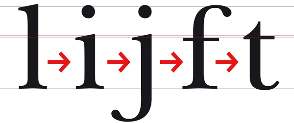
One-legged letters
The l, i, j, f and t are letters with a single stem. In terms of construction they are not generally very problematic. The i is a shortened l with a dot; the j is an i with a tail.
Back to top
V-shaped letters
It is clear to see that the forms of the w and the y share constructive similarities with the v. The construction of the capitals in this group is also the same. Only the lowercase version of the y includes a tail and the uppercase requires a few adjustments to integrate the stem into the design. The v forms of the w are made narrower in order to avoid the letter being far too wide in comparison to the other letters in the typeface.
Back to top
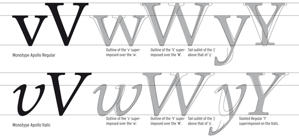
Although the so-called slanting of a roman typeface is not normally considered standard practice in the design of typefaces, the similarities between a slanted version of a regular Y and the italic Y are great. To prevent a letter falling over the right-hand diagonal of the italic is set more vertical. In general, the letter w is clearly visually narrower than the v.
Diagonal in lowercase and capital
This group includes the letters k, z and x. The letter k is a complex combination of inner and outer forms. It begins with a vertical stem against which two diagonals come together. The letter z has a simpler construction than the k. Two horizontal lines linked by a diagonal. The lowercase version is almost always a smaller representation of the uppercase, but several visual corrections are needed in the boldness and proportions. The x is a separate case because it consists only of diagonals. To avoid the x appearing top heavy, the point at which the diagonals meet is positioned slightly above the vertical middle point of the letter and/or the upper part of the letter is drawn a little narrower than the lower section whereby the white space of the upper part is smaller than the lower.
Back to top
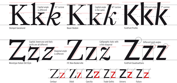
The design of the italic versions of both the k and the z can be very different, sometimes because the letter spacing of a basic serif would be too large and sometimes because the italic was traditionally a completely different typeface. The diagonals of the capitals and lowercase letters are usually not placed at the same angle.
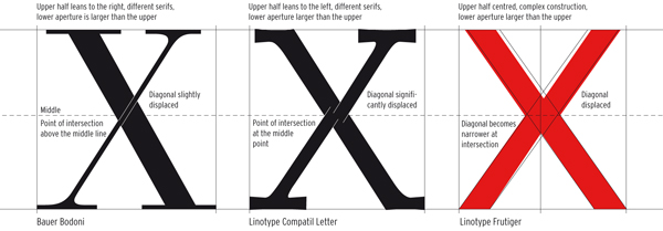
Although the X of the sans-serif Frutiger at first glance appears to consist of two diagonal strokes of equal thickness, the strokes actually become narrower towards the middle and the construction consists of four separate strokes, different in weight and placed irregularly in relation to each other.
Figures as components of a typeface
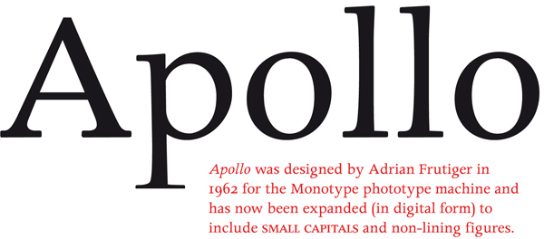
Figures are important components of a typeface. If numbers are used often in a body of text, they can have a significant influence on its legibility. This is why several variations are included in more recent typefaces, especially typefaces designed specifically for annual reports. As such, the graphic designer can be in possession of tabular figures, proportional old style figures and monospaced old style figures as well as fractions and specially designed small figures for use in footnotes, superscripts and subscripts.
Back to top
Scala by Martin Majoor was in 1988 one of the first digital typefaces that, for reasons of practicality, included old style figures as the default. The tabular figures (lower line of the upper diagram) can be found in the small capitals style (Scala-Caps).
The previous chapter detailed the first stage of a type design in which each character is carefully studied and adjusted until unity of form and colour of all characters is achieved. Although the designer has already put letters together to test how they combine in a word or block of text, creating a font for a computer is a labour-intensive task. The individual characters are merely the start of the process.
Back to top
The road to a font
Logistically, the production of digital type can be divided into three stages: Step 1 is the design phase; step 2 is the editing phase for digitising the design, composing the glyph databases, adding letter spacing and producing a kerning table; and step 3 is for hinting bitmaps and creating font formats.
Back to top
Step 1: the design phase
The first sketches of a new type design are still frequently made manually on paper. In some cases each letter is fully drawn by hand. In that case, they can be digitised using a digitiser, a kind of mouse with a magnifier that can very exactly transfer points in the drawing to a computer. Another possibility is to use the auto-trace function to have the software trace the outline from a scan. A letter can also be directly drawn on the computer, often with the help of a scan of the sketch (a template).
Above, a screen dump from the FontLab programme. The letter G is shown with selected letters on either side to help the designer compare mutual proportions.
Step 2: the editing phase
In this phase, the characters are aesthetically and technically optimised. Curves can be subtly changed and anchor points can be moved by means of coordinates so they exactly match comparable positions of other characters. Subsequently, a glyph database is generated with all the characters that the designer wants to use.
Above, a Demos glyph database in Mac OS Roman. The names are indicated above the glyphs. The letter n is selected for editing.
Step 3: hinting and producing fonts
To use the font, one must format it for various platforms like PC and Mac. In this phase, any hinting that is needed is also included. Hinting is defining bitmaps for low resolution rendering, usually on monitors and displays.
Above, typical font software windows. The largest character is that being edited, with anchor points, positions of the logo, the character or glyph database with the selected letter and the 12 pt bitmap letter in the hinting palette.
Interpolation of other variations
Interpolation is often used to create the big type families that are becoming more and more common. Interpolation is a method of generating intermediate forms between two existing masters, for instance a regular and a bold or extra bold.
Back to top
Letter spacing
The space between letters can be called functional white. This means that it partly influences the overall image of the typeface and the way it behaves in a printed text. In font software, letter spacing is determined by establishing the white space (spacing) on either side of the letter.
Back to top
Kerning
In the metal era letters in combinations like We, LT and Ty could be moved closer together to close the gap in their spacing only by physically shaving or cutting away part of the metal shank of the piece of type (a process called kerning). Now the software can easily move them as close as we wish. To adjust the spacing of these specific combinations, kerning values are generated for each problematic pair. These are the exceptions to the standard letter spacing. It is a very precise and time-consuming job. The construction of a good kerning table takes a lot of testing and adjusting.
Examples of important kerning pairs are:
Av Aw Ay Ta Te To Tr Tu Tw Ty Ya Yo
Wa We Wo we yo AC AT AV AW AY FA LT LV LW LY OA OV OW OY
PA TA TO VA VO WA WO
YA YO
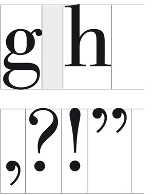
Examples of combinations with punctuation marks are:
A L P, P: D, W, V. V, f. r, t s
Back to top
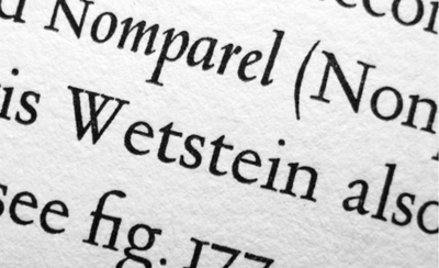
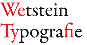
A text set in metal type and printed letterpress, from Typefoundries in The Netherlands (1978) set in Jan van Krimpens Romanée. Although the typography and typesetting are sublime, there is a clearly visible wide space in the We letter combination. This problem can be solved by kerning, easier in digital type than in metal type.
Above, spacing in the digital Garamond Premier Pro. The letters merge, as it were, into one another. Ligatures like the fi are made to suit the standard letter spacing, but with wider or narrower spacing their use is not recommended.
Word space and other spaces
For most typefaces, the word space is slightly smaller than the bounding box of an i, or a fourth of the font size (also called a fourth em space). As italics are often narrower, their bounding box is a fifth of an em space. The width of an em has the same value as the body size. For a 12 pt letter, the em space is 12 pt.
Back to top
Word space for Bodoni Classico and the white spaces of a few punctuation marks.
Type designers and typographers from the letterpress era had only just begun, reluctantly and full of apprehension, to get used to designing for phototypesetting equipment when the next technological revolution revealed itself: setting type using a computer. And all that in only one lifetime! For most of the somewhat older tradesmen from the metal type era, this revolution proved just too much: They didnt learn how to design for and with computers. After all, the five-century-long evolution to the ultimate, triumphant stage in the mastery of this technology had won great respect and admiration. They had conquered an extremely difficult technique and the resulting aesthetics largely rested on an illusion of effortlessness. These aesthetics were laid down in special formulas, rules and manifestoes, in which readability and optimum legibility were key concepts. Designing a bookface reflecting these concepts had become the consecration of a type designers profession.
Back to top
The phototypesetter
The first step after the metal type era was photographic typesetting. The application of computers in typesetting came about after the time, following the metal type era, in which characters were projected onto photosensitive film or paper via a xenon flash tube, like slides to a screen. This form of type production was a very slow process, for it was still a mechanical composition system and the characters had to be projected one by one. As a result, production left much to be desired, even though the flash tube itself was much faster than lead composition.
Back to top
From analogue to digital
The breakthrough came with the use of the cathode ray tube. The cathode ray tube is incidentally also used for projecting an image on the inside of the screen of a conventional television and the now old-fashioned CRT computer screens. The first cathode ray tube machines scanned analogue images of the letters and converted them to an electrical charge on the tube surface, which then functioned as an electronic memory. The storage was limited but the letter images could be enlarged or reduced by using lenses, and they were then transmitted to photosensitive material. The advantage of this technique was its speed. The second generation of cathode ray tube machines already stored the letterforms only as digital data in memory that was used to construct the letters rendered visibly on the cathode ray tube.
Back to top
Laser exposure
At the end of the 1970s, the first laser exposure machines appeared on the scene. The laser was much more refined, faster and produced more light than the cathode ray tube, which made it possible to switch from halftone paper to light-sensitive paper with a larger contrast. These first generation machines were only used to expose plain texts that then had to be physically assembled into a page. The next step involved the introduction of machines that were able to expose the whole page.
Back to top
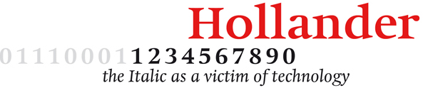
Hollander, a 1983 typeface by Gerard Unger, is inspired by seventeenth-century Dutch types such as those of Christoffel van Dijck. This is mainly visible in the generous proportions, the large x-height and the thick-thin contrast.
Font formats
In the previous chapter on producing type, the last step was to convert the font to a format that can be used in software and for output devices like laser printers, but also, for instance, on a screen. Some have been briefly discussed in the previous chapter and will now be described in more detail.
Back to top
PostScript
This language is designed for describing a page in image points. The RIP (Raster Image Processor), that was by this time already commonly used, is, simply put, an image point calculator that belongs to a certain imaging device and is only suitable for its resolution. What was special and innovative about the PostScript language that Adobe developed in 1982 was the platform and resolution independent page description. It is properly called a Page Description Language (PDL). PostScript is one of the important reasons behind the rapid development of desktop publishing.
Back to top
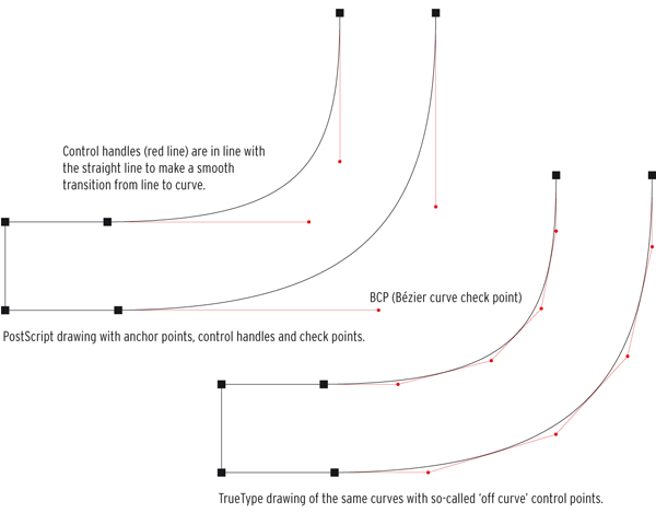
A PostScript drawing and a TrueType drawing. They use different formulas to calculate curves. PostScript works with cubic curves whereby the position of the handles and the Bézier control points determine the curve. TrueType uses quadratic splines with control points on the ends of the tangents along the curve, as shown on the left.
TrueType
Apple tried to negotiate with Adobe about releasing the Type 1 font technology so licensing fees could be limited and other parties would also be able to produce good-quality typefaces. Of course this was partly out of self-interest as Apple was paying licensing fees as well. Apple had already been working on various vector formats for typefaces in the 1980s because font technology played, and plays, an important role in the operating system. As Apple and Microsoft had common interests they decided to work on a new format together. The TrueType font technology, however, was used in its totality by Apple for its system 7 while Microsoft introduced it in Windows 3.1.
Back to top
QuickDraw GX
QuickDraw is the component in the Mac system that is responsible for the graphic representation on a computer screen. It is part of the Macintosh Toolbox that is stored in the computers permanent memory (ROM). All Mac software uses QuickDraw to not only display interface elements like windows and menus, but also to display images and typefaces. As such is it also a kind of page description language that can be used to print on non-PostScript printers as well; think of cheap inkjet printers and simple laser printers.
Back to top
Multiple Master
In the meantime, Adobe introduced a new technology that could be used within the existing PostScript Type 1 format. The Multiple Master format made it possible to create ones own variants (which was in fact already possible in the GX fonts), from extremely thin to extra bold and from narrow to wide. The master fonts were drawn as so-called primary fonts and the variants were generated from these master fonts by the FontCreator programme, which was supplied as part of the package.
Back to top
Above Myriad MM, with the Regular indicated in red. In grey, the Light Regular, SemiBold and Bold. In the corners, the primary fonts that serve as the basis for generating the intermediate variants.
OpenType
After the downfall of QuickDraw GX and the Multiple Master technology, it became clear that connections to existing formats needed to be established not only to improve typographic performance, but also for practical reasons. A system typeface that could service all language versions would save producers of operating systems a lot in logistical terms, but it would also make it easier for developers of programme software to create localised versions. Added to this picture is Adobes desire to maintain the PostScript format, although it had been rendered obsolete by TrueType. Together with Microsoft, Adobe therefore developed the OpenType format. This is effectively an extension of TrueType that also supports the PostScript format. Special about OpenType is furthermore that it is cross-platform; it can be used on both Apple and Windows computers and consists of one file that stores outline, metric and bitmap data.
Back to top
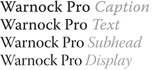
So-called opticals are supplied with Warnock Pro, an OpenType typeface by Adobe. All four variants are depicted below: the Caption for smaller sizes, the Text for normal text sizes, the Subhead for sub-headings and the Display for larger headings.
======================================================================================
Leaf through Letter Fountain
Back to top
The design process
In this chapter we will investigate the margins available to the designer and study the form of the letter in detail. The number of different typefaces currently available is thought to be around 50,000 to 60,000. Is it then really necessary to design even more new types? Well, the same question could also be asked about the design of a new chair or a new musical composition. The times in which we live will always play a part in this process by applying different demands and awakening new expectations. The desire for innovation and change is always present.
Back to top
The first capitals
The Roman inscriptional capitals, the mother of all western capital or majuscule scripts (see also the chapter The Roman and the Roman Empire), have a geometric construction with a square base.
Back to top
The Adobe Trajan shown above, which was designed by Carol Twombly and is based on the inscriptions on Trajans Column, shows the geometrical construction method used to draw on the stone before the cutting began.
Lhistoire se répète
With the invention of printing presses and the subsequent growth in the production of printed material, a uniform grey tone within a body of text and optimal legibility became more and more important. Type designers as well as printers who certainly in the early days were responsible for good typography became more aware of the details of type. There followed a centuries-long continual stream of new typefaces onto the market.
Back to top
Three letters are shown above. This illustration functions as a quick reference from the beginnings of western type design, with Imperial Roman capitals (Trajan), via Bodoni (here the Classico by Franko Luin) and then to Linotype Compatil Exquisit a journey spanning almost 2000 years of (seriffed) type design.
The lowercase letter
Lowercase letters did not exist in Roman times. There is therefore no historical reference for these small letters such as there is for the capitals. The handwritten, vertical square capitals and the rustic capitals written with a slanting quill were the starting points for the development of the uncial, the half uncial and the Carolingian minuscule.
Back to top
The examples shown above illustrate that capitals are mostly heavier than lowercase letters. They also show that the x-height of sans-serifs is usually larger than in serif letters. Of course there is an exception to every rule. The weight of the capitals and lowercase letters in TheSerif and the TheSans is as good as equal.
Classification according to form and construction
Depending on their form and construction, the 26 characters of the alphabet can be arranged into groups, whereby a distinction is made between a group for the capitals and a group for lowercase letters.
Back to top
What you measure is not what you see
As can be seen above, many different forms and constructions must be taken into account when designing a new type. An important visual correction is the extrusion of curved (and protruding) forms past the baseline and top line. This also applies to vertical alignment between curved and straight forms.
Back to top
A number of corrections have been applied to the oval and rectangular shapes above. The first oval has the same width and height as the rectangle next to it, yet the oval seems smaller and appears out of line with the rectangle (even though it actually lines up perfectly). The second oval has been visually corrected, both in width and height. The diagram on the second line shows that equal white space between the shapes in the middle does not appear the same. A visual correction has been applied to the bottom example.
A visual correction is also needed for the distance between letters. It is not possible to simply place letters next to each other with equal spacing between them. The letters must be altered to a uniform visual white space. This means that the white space between the letters should appear the same.
The word minimum appears above in Avenir by Adrian Frutiger. The letter spacing is uniform because all the letters are vertically defined. It is a good way to determine an acceptable amount of letter spacing in the early stages of a new design, which can subsequently be applied to the less clearly defined letters. In the trade this is called fitting the type.
The first letters
Each type designer has her or his own way of working toward the creation of a new typeface. As well as the H, O, n, l, o and p, Dutch type designer Gerard Unger also likes to include the R, a and g in his first design sketches. Alongside this unique working method, there are also a number of facts to take into account during the design process. A square appears to be square only if it is drawn 1% wider and the same is true for circular forms. To make a circular form appear the same size as a square, it should extend an extra 2% to 3% on each side. The point of a triangle appears to line up with a square only if it extends 3% further. These are of course just indications. The definite measurements are completely dependent on the design and the designers eye.
Back to top
The Monotype Perpetua shown above is a Transitional in Vox+. It has an almost vertical to vertical axis. The lowercase letters are slightly thinner than the capitals and the capitals have a greater thick-thin contrast.
The letter o
This letter appears simple in construction. Looking at Futura, this could quite easily be true, but even the construction of this version is not exactly geometric. The circles and ovals have been visually corrected in the corners and curves.
Back to top
The letter l
Just as the letter o is defining in the form of the curves in a type design, so is the lowercase l defining in the thickness of the stem. Just as with the curves, it does not follow that everything with a similar form is equal in thickness, but it is a starting point for similar forms.
Back to top
The examples above show that there are numerous options for the design of the top serif of the ascender and the proportions of the x-height. The letter l forms the basis for many letters, making the design of this letter very important for the overall look of a typeface.
The letters c and e
When the proportions, contrast, maximal curve thickness and thickness of the stem have been defined, the related forms can then be designed. The logical steps from the o are the c and e.
Back to top
The terminals of the c are the most varied in shape, ranging from the clearly visible form of an old-fashioned pen stroke to the clean lines of a teardrop shape.
The capital C in italic and regular superimposed. Left: Stempel Garamond with an italic that is visibly different from the roman. Right: Rotis, whereby the roman is similar in appearance to an italic as it leans forwards slightly.
Rounded letters with a stem
Four letters of the alphabet the d, p, b and q appear quite simply to be a blend of the o with a vertical stem. The p looks like a rotated version of the d and likewise the q a rotated b. But this could not be more wrong. Even the most geometric typefaces contain subtle differences. The greatest differences can be seen in the seriffed types.
Back to top
In the overview above, the characters appear to be mirror images of each other. Wrong! With Bodoni it seems as if two letters have been merged into one, while with the Joanna each letter has its own characteristic shape.
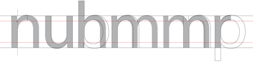
Letters with legs
There are four letters which are directly related to each other because they all stem from one letter: the n. These are the letters n, h, m and u. The letter r can also be included in this group because it, perhaps a little generalised, can be seen as a cut-off n, in the case of the sans-serifs at least.
Back to top
Three outsiders
The a, s and g require a depth of knowledge and skill from the type designer not only to design them in line with the rest of the typeface but also because the curves must be balanced and fluent. While geometrically rounded shapes form a good basis for the design of the letters o, e and c, these letters are more complicated than a simple circle. Designs elements similar to the other letters must be incorporated into these letters.
Back to top
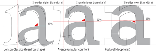
The a consists of a bowl and curves. The closed bowl is slightly higher than the middle of the letter. The connection of the bowl with the stem can be formed in many ways.
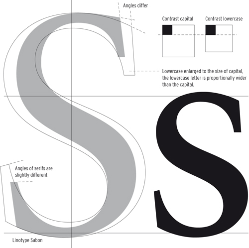
The s contains no straight lines. The roman can be drawn by starting with two circles, one above the other, the lower slightly larger than the upper. The letter therefore has a foundation and as such has better visual proportions.
Left is the S of Sabon, with narrower proportions than the lowercase version. This is not always the case. The lowercase s sometimes has the same proportions as the capital and is sometimes relatively wider.
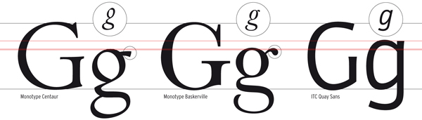
In contrast to the s, the capital version of the G and the lowercase version are constructed in completely different ways. The two-storey version of the g is a beautiful and complicated construction. It consists of a small o with an ear, and below this a loop which can be drawn either open or closed. The o is a smaller version of the lowercase letter (approximately 60 70%). The loop can vary widely in nature between different typefaces.
The capital G appears to be family of the C and the lowercase g, due to its wealth of shapes, is often called the most beautiful letter of the alphabet. Centaur contains traces of handwriting in the g, certainly in the italic. Baskerville has a more similar roman and italic but the italic is clearly narrower. Quay has a businesslike g and the width of the italic is similar to the roman.
One-legged letters
The l, i, j, f and t are letters with a single stem. In terms of construction they are not generally very problematic. The i is a shortened l with a dot; the j is an i with a tail.
Back to top
V-shaped letters
It is clear to see that the forms of the w and the y share constructive similarities with the v. The construction of the capitals in this group is also the same. Only the lowercase version of the y includes a tail and the uppercase requires a few adjustments to integrate the stem into the design. The v forms of the w are made narrower in order to avoid the letter being far too wide in comparison to the other letters in the typeface.
Back to top
Although the so-called slanting of a roman typeface is not normally considered standard practice in the design of typefaces, the similarities between a slanted version of a regular Y and the italic Y are great. To prevent a letter falling over the right-hand diagonal of the italic is set more vertical. In general, the letter w is clearly visually narrower than the v.
Diagonal in lowercase and capital
This group includes the letters k, z and x. The letter k is a complex combination of inner and outer forms. It begins with a vertical stem against which two diagonals come together. The letter z has a simpler construction than the k. Two horizontal lines linked by a diagonal. The lowercase version is almost always a smaller representation of the uppercase, but several visual corrections are needed in the boldness and proportions. The x is a separate case because it consists only of diagonals. To avoid the x appearing top heavy, the point at which the diagonals meet is positioned slightly above the vertical middle point of the letter and/or the upper part of the letter is drawn a little narrower than the lower section whereby the white space of the upper part is smaller than the lower.
Back to top
The design of the italic versions of both the k and the z can be very different, sometimes because the letter spacing of a basic serif would be too large and sometimes because the italic was traditionally a completely different typeface. The diagonals of the capitals and lowercase letters are usually not placed at the same angle.
Although the X of the sans-serif Frutiger at first glance appears to consist of two diagonal strokes of equal thickness, the strokes actually become narrower towards the middle and the construction consists of four separate strokes, different in weight and placed irregularly in relation to each other.
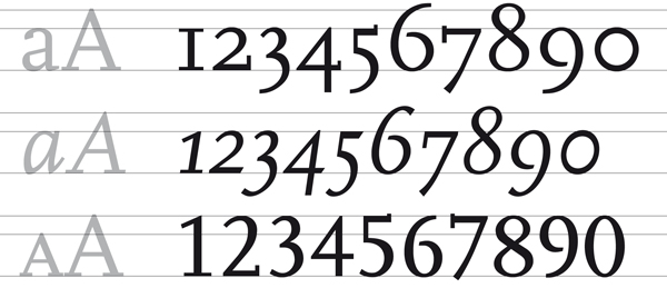
Figures as components of a typeface
Figures are important components of a typeface. If numbers are used often in a body of text, they can have a significant influence on its legibility. This is why several variations are included in more recent typefaces, especially typefaces designed specifically for annual reports. As such, the graphic designer can be in possession of tabular figures, proportional old style figures and monospaced old style figures as well as fractions and specially designed small figures for use in footnotes, superscripts and subscripts.
Back to top
Scala by Martin Majoor was in 1988 one of the first digital typefaces that, for reasons of practicality, included old style figures as the default. The tabular figures (lower line of the upper diagram) can be found in the small capitals style (Scala-Caps).
From type to font
The previous chapter detailed the first stage of a type design in which each character is carefully studied and adjusted until unity of form and colour of all characters is achieved. Although the designer has already put letters together to test how they combine in a word or block of text, creating a font for a computer is a labour-intensive task. The individual characters are merely the start of the process.
Back to top
The road to a font
Logistically, the production of digital type can be divided into three stages: Step 1 is the design phase; step 2 is the editing phase for digitising the design, composing the glyph databases, adding letter spacing and producing a kerning table; and step 3 is for hinting bitmaps and creating font formats.
Back to top
Step 1: the design phase
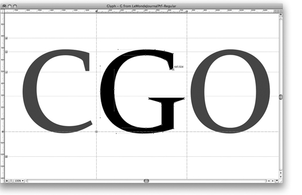
The first sketches of a new type design are still frequently made manually on paper. In some cases each letter is fully drawn by hand. In that case, they can be digitised using a digitiser, a kind of mouse with a magnifier that can very exactly transfer points in the drawing to a computer. Another possibility is to use the auto-trace function to have the software trace the outline from a scan. A letter can also be directly drawn on the computer, often with the help of a scan of the sketch (a template).
Above, a screen dump from the FontLab programme. The letter G is shown with selected letters on either side to help the designer compare mutual proportions.
Step 2: the editing phase
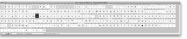
In this phase, the characters are aesthetically and technically optimised. Curves can be subtly changed and anchor points can be moved by means of coordinates so they exactly match comparable positions of other characters. Subsequently, a glyph database is generated with all the characters that the designer wants to use.
Above, a Demos glyph database in Mac OS Roman. The names are indicated above the glyphs. The letter n is selected for editing.
Step 3: hinting and producing fonts
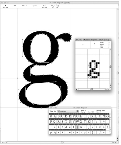
To use the font, one must format it for various platforms like PC and Mac. In this phase, any hinting that is needed is also included. Hinting is defining bitmaps for low resolution rendering, usually on monitors and displays.
Above, typical font software windows. The largest character is that being edited, with anchor points, positions of the logo, the character or glyph database with the selected letter and the 12 pt bitmap letter in the hinting palette.
Interpolation of other variations
Interpolation is often used to create the big type families that are becoming more and more common. Interpolation is a method of generating intermediate forms between two existing masters, for instance a regular and a bold or extra bold.
Back to top
Letter spacing
The space between letters can be called functional white. This means that it partly influences the overall image of the typeface and the way it behaves in a printed text. In font software, letter spacing is determined by establishing the white space (spacing) on either side of the letter.
Back to top
Kerning
In the metal era letters in combinations like We, LT and Ty could be moved closer together to close the gap in their spacing only by physically shaving or cutting away part of the metal shank of the piece of type (a process called kerning). Now the software can easily move them as close as we wish. To adjust the spacing of these specific combinations, kerning values are generated for each problematic pair. These are the exceptions to the standard letter spacing. It is a very precise and time-consuming job. The construction of a good kerning table takes a lot of testing and adjusting.
Examples of important kerning pairs are:
Av Aw Ay Ta Te To Tr Tu Tw Ty Ya Yo
Wa We Wo we yo AC AT AV AW AY FA LT LV LW LY OA OV OW OY
PA TA TO VA VO WA WO
YA YO
Examples of combinations with punctuation marks are:
A L P, P: D, W, V. V, f. r, t s
Back to top
A text set in metal type and printed letterpress, from Typefoundries in The Netherlands (1978) set in Jan van Krimpens Romanée. Although the typography and typesetting are sublime, there is a clearly visible wide space in the We letter combination. This problem can be solved by kerning, easier in digital type than in metal type.
Above, spacing in the digital Garamond Premier Pro. The letters merge, as it were, into one another. Ligatures like the fi are made to suit the standard letter spacing, but with wider or narrower spacing their use is not recommended.
Word space and other spaces
For most typefaces, the word space is slightly smaller than the bounding box of an i, or a fourth of the font size (also called a fourth em space). As italics are often narrower, their bounding box is a fifth of an em space. The width of an em has the same value as the body size. For a 12 pt letter, the em space is 12 pt.
Back to top
Word space for Bodoni Classico and the white spaces of a few punctuation marks.
Digital formats
Type designers and typographers from the letterpress era had only just begun, reluctantly and full of apprehension, to get used to designing for phototypesetting equipment when the next technological revolution revealed itself: setting type using a computer. And all that in only one lifetime! For most of the somewhat older tradesmen from the metal type era, this revolution proved just too much: They didnt learn how to design for and with computers. After all, the five-century-long evolution to the ultimate, triumphant stage in the mastery of this technology had won great respect and admiration. They had conquered an extremely difficult technique and the resulting aesthetics largely rested on an illusion of effortlessness. These aesthetics were laid down in special formulas, rules and manifestoes, in which readability and optimum legibility were key concepts. Designing a bookface reflecting these concepts had become the consecration of a type designers profession.
Back to top
The phototypesetter
The first step after the metal type era was photographic typesetting. The application of computers in typesetting came about after the time, following the metal type era, in which characters were projected onto photosensitive film or paper via a xenon flash tube, like slides to a screen. This form of type production was a very slow process, for it was still a mechanical composition system and the characters had to be projected one by one. As a result, production left much to be desired, even though the flash tube itself was much faster than lead composition.
Back to top
From analogue to digital
The breakthrough came with the use of the cathode ray tube. The cathode ray tube is incidentally also used for projecting an image on the inside of the screen of a conventional television and the now old-fashioned CRT computer screens. The first cathode ray tube machines scanned analogue images of the letters and converted them to an electrical charge on the tube surface, which then functioned as an electronic memory. The storage was limited but the letter images could be enlarged or reduced by using lenses, and they were then transmitted to photosensitive material. The advantage of this technique was its speed. The second generation of cathode ray tube machines already stored the letterforms only as digital data in memory that was used to construct the letters rendered visibly on the cathode ray tube.
Back to top
Laser exposure
At the end of the 1970s, the first laser exposure machines appeared on the scene. The laser was much more refined, faster and produced more light than the cathode ray tube, which made it possible to switch from halftone paper to light-sensitive paper with a larger contrast. These first generation machines were only used to expose plain texts that then had to be physically assembled into a page. The next step involved the introduction of machines that were able to expose the whole page.
Back to top
Hollander, a 1983 typeface by Gerard Unger, is inspired by seventeenth-century Dutch types such as those of Christoffel van Dijck. This is mainly visible in the generous proportions, the large x-height and the thick-thin contrast.
Font formats
In the previous chapter on producing type, the last step was to convert the font to a format that can be used in software and for output devices like laser printers, but also, for instance, on a screen. Some have been briefly discussed in the previous chapter and will now be described in more detail.
Back to top
PostScript
This language is designed for describing a page in image points. The RIP (Raster Image Processor), that was by this time already commonly used, is, simply put, an image point calculator that belongs to a certain imaging device and is only suitable for its resolution. What was special and innovative about the PostScript language that Adobe developed in 1982 was the platform and resolution independent page description. It is properly called a Page Description Language (PDL). PostScript is one of the important reasons behind the rapid development of desktop publishing.
Back to top
A PostScript drawing and a TrueType drawing. They use different formulas to calculate curves. PostScript works with cubic curves whereby the position of the handles and the Bézier control points determine the curve. TrueType uses quadratic splines with control points on the ends of the tangents along the curve, as shown on the left.
TrueType
Apple tried to negotiate with Adobe about releasing the Type 1 font technology so licensing fees could be limited and other parties would also be able to produce good-quality typefaces. Of course this was partly out of self-interest as Apple was paying licensing fees as well. Apple had already been working on various vector formats for typefaces in the 1980s because font technology played, and plays, an important role in the operating system. As Apple and Microsoft had common interests they decided to work on a new format together. The TrueType font technology, however, was used in its totality by Apple for its system 7 while Microsoft introduced it in Windows 3.1.
Back to top
QuickDraw GX
QuickDraw is the component in the Mac system that is responsible for the graphic representation on a computer screen. It is part of the Macintosh Toolbox that is stored in the computers permanent memory (ROM). All Mac software uses QuickDraw to not only display interface elements like windows and menus, but also to display images and typefaces. As such is it also a kind of page description language that can be used to print on non-PostScript printers as well; think of cheap inkjet printers and simple laser printers.
Back to top
Multiple Master
In the meantime, Adobe introduced a new technology that could be used within the existing PostScript Type 1 format. The Multiple Master format made it possible to create ones own variants (which was in fact already possible in the GX fonts), from extremely thin to extra bold and from narrow to wide. The master fonts were drawn as so-called primary fonts and the variants were generated from these master fonts by the FontCreator programme, which was supplied as part of the package.
Back to top
Above Myriad MM, with the Regular indicated in red. In grey, the Light Regular, SemiBold and Bold. In the corners, the primary fonts that serve as the basis for generating the intermediate variants.
OpenType
After the downfall of QuickDraw GX and the Multiple Master technology, it became clear that connections to existing formats needed to be established not only to improve typographic performance, but also for practical reasons. A system typeface that could service all language versions would save producers of operating systems a lot in logistical terms, but it would also make it easier for developers of programme software to create localised versions. Added to this picture is Adobes desire to maintain the PostScript format, although it had been rendered obsolete by TrueType. Together with Microsoft, Adobe therefore developed the OpenType format. This is effectively an extension of TrueType that also supports the PostScript format. Special about OpenType is furthermore that it is cross-platform; it can be used on both Apple and Windows computers and consists of one file that stores outline, metric and bitmap data.
Back to top
So-called opticals are supplied with Warnock Pro, an OpenType typeface by Adobe. All four variants are depicted below: the Caption for smaller sizes, the Text for normal text sizes, the Subhead for sub-headings and the Display for larger headings.
======================================================================================
Leaf through Letter Fountain