
Calypso PF by Roger Excoffon.
Free download!
Free download!
> Download Calypso PF for Mac and Windows
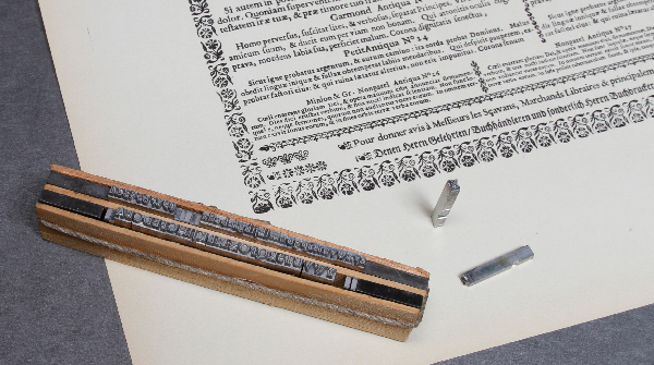
Almost every typeface that was available in metal type is digitized since the early nineties of the last century. However, we discovered that the digital versions of Calypso (Roger Excoffon) did not meet our expectations. So, we decided to make our own version based on metal type, cast recently from the original matrices from Fonderie Olive (and not used for print). Roger Excoffon was a designer that made some of the most remarkable typefaces in his time. Examples are Antique Olive, Mistral, Choc and Banco. They all had a French touch with an open mind of doing things different. Antique Olive was an answer on the success of Helvetica and Univers. Excoffon did not copy blind like many others but made a typeface that has its own and distinctive character. Calypso was also a typeface that had no competitors. We like the unconventional character of this typeface. It is highly redundant and the readability is bad. And yet it is wonderful like many other designs from Excoffon. And isn't less more? Download Calypso PF and make a tribute to this designer! Look also at 'The making of Calypso PF' on YouTube: http://www.youtube.com/watch?v=UTbwg7Sz4Xc
Please help us with the translation in your language of this text!
Back to top
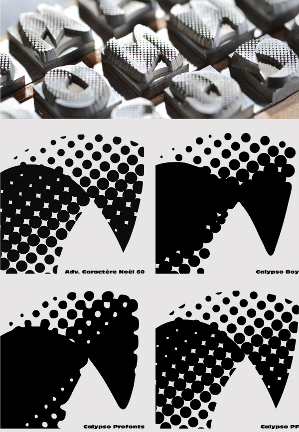
Lecture on the choice of a typeface
> Descargar Lecture on the choice of a typeface (English)
This lecture on the history of type deals with the first forms of communication from more than 15,000 years ago until book typography in the present time. It shows many examples of books and in the supplied Word-file there is an explanation for every sheet. The sheets are supplied as a PDF file. Please let us know when you find an error in one of the documents or when you find incorrect information.
Back to top
Conferencia sobre la historia de tipo
> Descargar Conferencia sobre la historia de tipo
This lecture on the history of type deals with the first forms of communication from more than 15,000 years ago until book typography in the present time. It shows many examples of books and in the supplied Word-file there is an explanation for every sheet. The sheets are supplied as a PDF file. Please let us know when you find an error in one of the documents or when you find incorrect information.
Back to top
Ejercicio de formas de letras
> Descargar el ejercicio de formas de letras
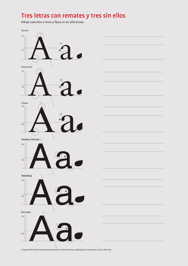
Este ejercicio, utilizado con propósitos educativos desde la primera publicación de Fuente de letras, ayuda a los estudiantes a identificar las diferencias entre tres tipos de letras con remates similares y tres tipos sin remates usados con frecuencia. El hecho de dibujar estas letras a mano ayuda a los estudiantes a ser más conscientes de las sutiles diferencias que influyen en el efecto tipográfico al aplicarlas en un diseño. En este ejercicio solo se muestran la A mayúscula y la a minúscula, pero en el ejemplar impreso de Fuente de letras encontrarás todo el alfabeto.
Volver al principio
> Descargar la cronología de tipografía y arte
Este ejercicio, utilizado con propósitos educativos desde la primera publicación de Fuente de letras, ayuda a los estudiantes a identificar las diferencias entre tres tipos de letras con remates similares y tres tipos sin remates usados con frecuencia. El hecho de dibujar estas letras a mano ayuda a los estudiantes a ser más conscientes de las sutiles diferencias que influyen en el efecto tipográfico al aplicarlas en un diseño. En este ejercicio solo se muestran la A mayúscula y la a minúscula, pero en el ejemplar impreso de Fuente de letras encontrarás todo el alfabeto.
Volver al principio
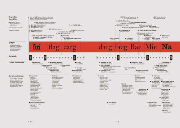
Cronología de tipografía y arte
> Descargar la cronología de tipografía y arte
Esta cronología muestra la correlación entre tipos de letra históricos y corrientes en la pintura y el diseño. Arte, diseño y tipografía se han alimentado mutuamente durante muchos siglos. De ahí que esta cronología sea muy valiosa para propósitos pedagógicos (y es una de las partes más copiadas del libro).
Volver al principio
> Descargar la Cronología de empresas tipográficas
Volver al principio
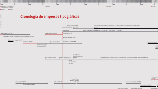
Cronología de empresas tipográficas
> Descargar la Cronología de empresas tipográficas
Esta exclusiva cronología es una representación gráfica del extenso índice de empresas tipográficas incluido en Fuente de letras. Esta cronología muestra cómo las empresas tipográficas se desarrollaron a lo largo de los años, compitiendo, uniéndose y creando nuevas empresas. Identifica los periodos más importantes del diseño innovador de tipos y de los materiales, esto es, las progresivas etapas que nos han llevado a donde estamos hoy en día.
Volver al principio
Volver al principio
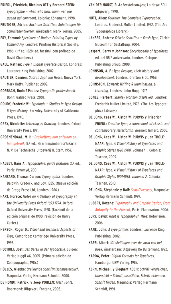
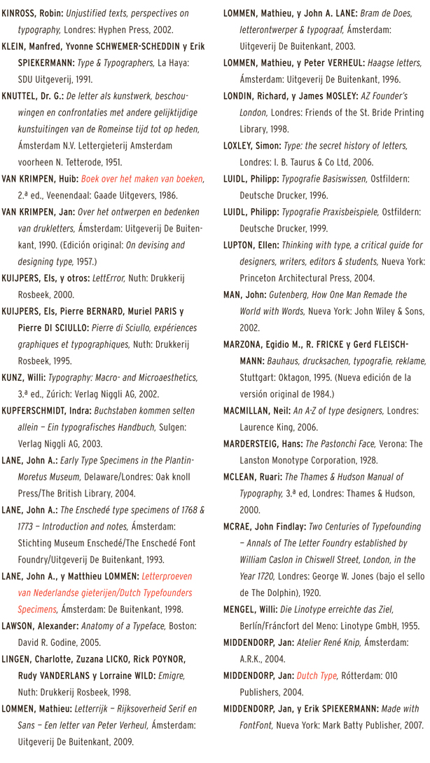
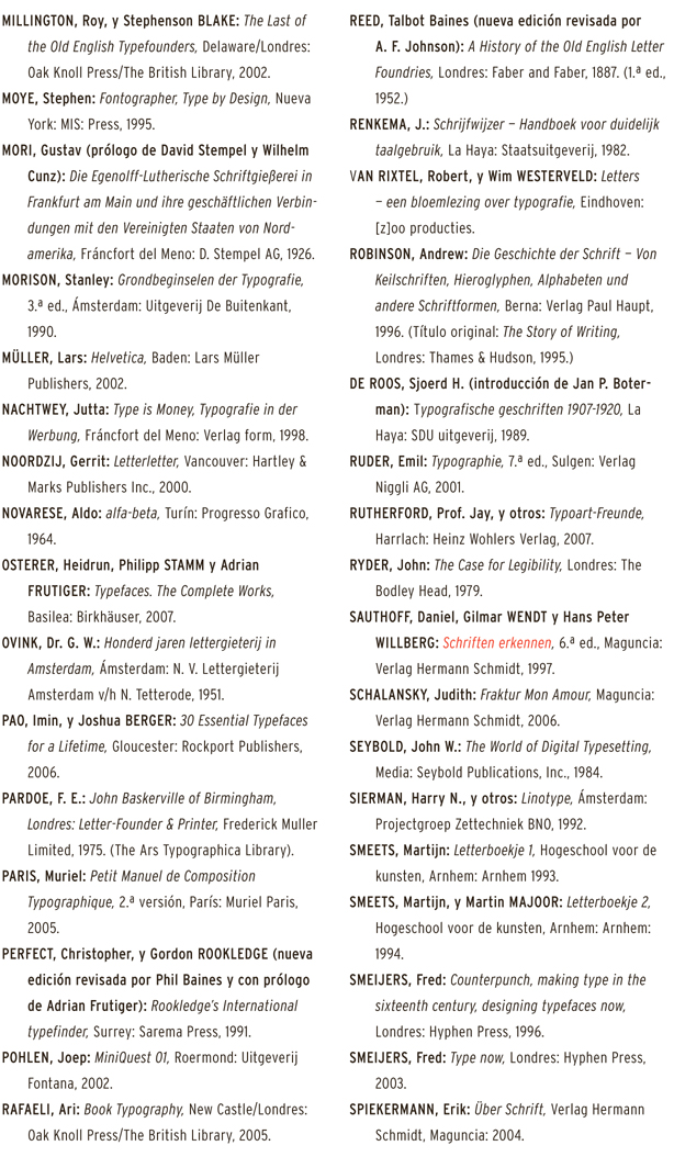
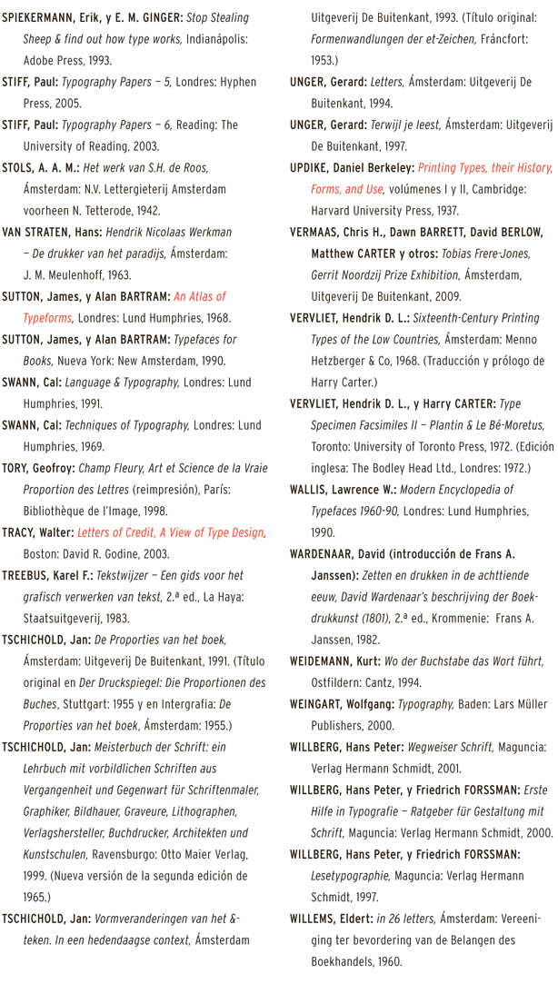
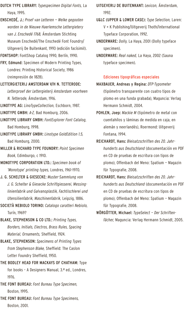
Bibliografía
Para realizar esta obra se han consultado docenas de libros, así como otras publicaciones; al fin y al cabo, la historia de la tipografía se basa en su mayor parte en la palabra escrita e impresa. Con este libro nos hemos apoyado en la labor de todos aquellos que no ahorraron esfuerzos para dejar por escrito los conocimientos y experiencias que habían adquirido. Los títulos de los libros,
cuyo contenido ha tenido una extraordinaria influencia en la obra Fuente de letras, han sido reproducidos en rojo. En Internet se pueden encontrar con cierta facilidad las ediciones que ya no están disponibles en las librerías. Los diccionarios, muestrarios de tipos y ediciones especiales han sido listados por separado.
La bibliografía se ha limitado a las publicaciones aparecidas en forma de libro.
Volver al principio
======================================================================================
Volver al principio
======================================================================================